Introduction
Festivawl - All your festivals in one app
Festivawl is the brainchild of myself as the CEO and Designer, and my good friend and Co-Founder, Cipri, who serves as the CTO. We're building this product as a springboard for our entrepreneurial careers, aiming to address a problem most festival-goers have: the inconsistent, confusing landscape of individual festival apps.
Navigate faster!


The Challenge
Addressing a Universal Problem
Navigating the fragmented ecosystem of individual festival apps can be a headache for users. Each festival having its own isolated app imposes a unique interface and performance level on festival-goers. The need for downloading different apps, creating multiple accounts, and adapting to a new UI every time complicates what should be a fun experience.
Crafting the Solution
A Unified Festival Dashboard
We envision Festivawl as the go-to platform that aggregates all festival experiences into a singular, easy-to-use interface. The design incorporates a calendar-like view reminiscent of Google Calendar, ensuring immediate user familiarity and facilitating intuitive navigation.
Business Approach
Prioritizing User Base Growth
Our initial focus is on user adoption, striving to demonstrate the tangible benefits of Festivawl to festival-goers and organizers alike. We believe in establishing value first, which will lay the foundation for future monetization strategies.
Development Highlights
Research & Analysis
Before diving into development, I scouted Mobbin.com to analyze calendar apps, laying down a benchmark for what Festivawl’s calendar should offer. The aim was to understand how these apps work, look, and feel. Further, we carried out competitive benchmarking to understand what sets us apart from the competition. The realization was eye-opening: even though calendar views are standard for calendar apps, ours was unique among festival apps.
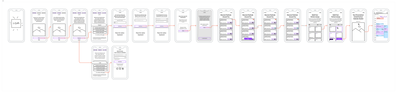
Initial Brainstorming and User Flow
Cipri and I put our heads together to come up with the first draft of the user flow. The flow did go through several iterations, but the essence remained the same.

- Tap to Zoom In
Wireframing & Validation
My tool of choice for wireframing is Figjam, especially for the complex Calendar component. Ensuring that Cipri could implement the logic efficiently was a priority, so we sought to perfect this right from the get-go.
- Tap to Zoom In
High-Fidelity Design
Opting for a dark theme, I experimented with a subtle noise effect for the background. This unique visual style was carried over to other elements by manipulating their opacity.
Unique Challenges
- Artist Selection: I decided to feature artists with background-removed images, a task that required manual effort via remove.bg. Although not scalable (it took me 2 hours to do 70 artists), it was feasible for the MVP.
- Calendar View Challenges: The calendar required both vertical and horizontal scrolling, a complex task from a development standpoint. Though this feature is hard to prototype in Figma, we are optimistic about its implementation.
User Research, Feedback, and Iterations
Building a Community for User Feedback
To kick off the validation process for Festivawl, I took to social media to create a buzz and gather potential users in a dedicated Discord community. This provided a platform to build in public, allowing for real-time feedback and transparent development.
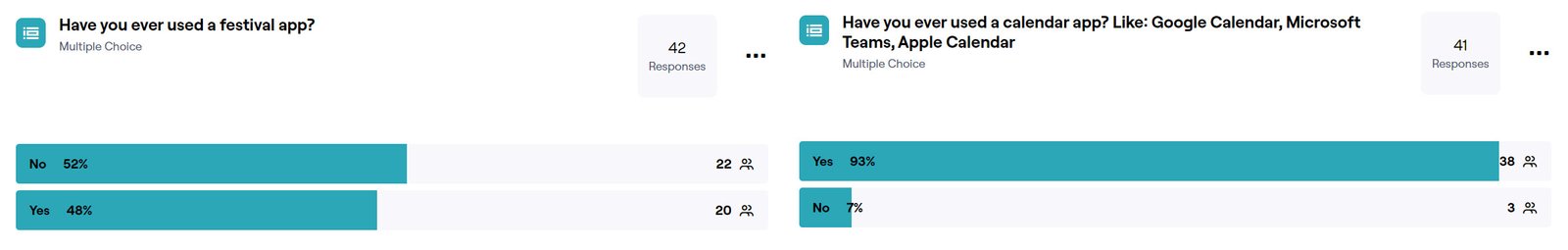
Running Maze Prototype Tests
In the community, we released a Maze prototype and were thrilled to receive 42 responses. The data was revealing: while only 48% had experience using a festival app, an overwhelming 93% were familiar with calendar apps like Google Calendar, Teams, or Apple Calendar.
Key Metrics and User Behavior
We observed a 35% drop-off rate during the testing phase. A deep dive into user behavior showed that this drop-off mainly occurred because participants were more interested in exploring the design rather than following the instructions for insightful feedback. For the remaining 65%, we had a high direct success rate of 93%, a promising metric that validated our design choices to an extent.
Learning from Feedback and Making Iterations
We didn’t just stop at gathering data; we listened, learned, and iterated. Here are some key improvements we made based on the user feedback:
- Registration Flow Adjustment: Originally, the registration process began with users choosing a username. The idea was to give them a small “win” before proceeding to enter their email. However, user feedback revealed that this flow was against their mental model, which expected an email-first approach. Acting on this, we adapted the flow to align with user expectations.
- Copy Refinements: Several participants found the copy to be confusing or awkward, prompting us to revise it for better clarity and impact.
- Calendar Design Overhaul: Initially, our calendar was rich in colors. My assumption was that users would eventually find the colors helpful for navigation. However, feedback suggested that the color scheme was overwhelming. I took this as an opportunity to delve into color psychology and revised the calendar design accordingly. The new design employs a tetradic color scheme, and after running an A/B test within our Discord community, it was overwhelmingly favored.

By incorporating this valuable feedback, we were able to significantly improve the user experience and meet expectations more closely, demonstrating our commitment to a user-centered design approach.
The Wider Skillset: Beyond App Design
Wearing Many Hats
Beyond design and product development, I’ve extended my role into realms like marketing and sales, website development, and social media strategy. This holistic approach has provided a more rounded view of the business and has been an invaluable learning experience.
Web Presence: More Than a Landing Page
In anticipation of our launch, I crafted an interactive landing page using WordPress and Elementor. It serves not only as an aesthetic extension of our brand but also as an engaging prelude to the app we are about to release.
Final Notes
What Have I Learned?
This project has been a lesson in the value of iterative design and continuous user feedback. It has taught me the importance of aligning a product’s UI/UX design with the mental models of its target audience. Furthermore, I’ve gained valuable insights into balancing aesthetics with functionality, particularly in designing the app’s calendar view and artist selection process. Overall, the project has expanded my skill set and further emphasized the importance of interdisciplinary collaboration for achieving a comprehensive and well-executed product design.
Conclusion
The Festivawl project demonstrates the power of design thinking in solving a common pain point in the festival-going experience. By centralizing information and standardizing UI across multiple festivals, the app has not only enhanced user experience but also provided a viable, scalable solution for festival organizers. Through its development, we’ve navigated the complexities of integrating diverse event data into a single, user-friendly calendar view, emphasizing the importance of design in creating effective, intuitive user interfaces.
That's a wrap
Jump straight into other case study below