Introduction
Sylq Onboarding - KYC/KYB
The registration process is vital for merchants looking to accept payments from customers and settle them directly into their bank accounts. Sylq's Automated Onboarding is designed to make this process as seamless as possible while navigating the complex regulations that fintech companies like ours must adhere to.
The Challenge
Why Was Automated Onboarding Needed?
At the onset of this project, the merchant onboarding process was cumbersome and exhausting. Manually registering merchants restricted us to a limited number of new accounts each day, making it a bottleneck for scaling the business. Our Compliance Analyst, Karina, would manually collect merchant details, sift through three different programs to assess risk scores, and manage all documentations.
This manual process was not only inefficient but also unattractive to large businesses in our target market, limiting our ability to compete effectively.
Objective: To automate the entire onboarding process to handle hundreds of new merchant registrations daily, making it user-friendly, scalable, and compliant with stringent fintech regulations.
Research & Planning
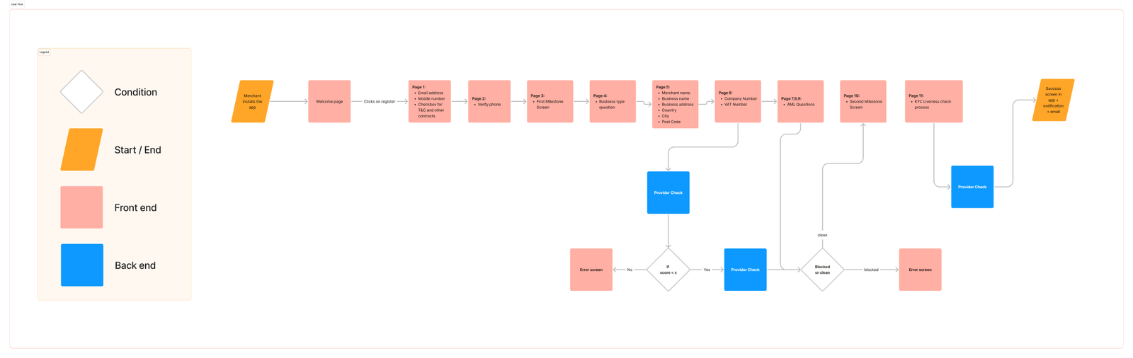
Understanding the Needs and Limitations
- Tap to Zoom In
Competitor Benchmarking and Industry Research
Before diving into wireframing, I undertook competitor analysis to grasp the industry standards, and also completed a course at Uxcel focused on frictionless onboarding.
The Solution
First Iteration: Wireframing
My initial wireframe draft was strategically designed to not just make the merchant’s onboarding journey transparent but also to alleviate the typically exhausting nature of KYC/KYB processes. The design incorporated two critical elements:
- Progress Transparency: At each stage, the design clearly indicated where the merchant was in the process and what was still required of them. This transparent approach empowered the merchant by letting them know exactly where they stood at any given moment.
- Positive Reinforcement: Recognizing that KYC/KYB processes can be tedious, I incorporated motivating messages and encouraging feedback after each completed milestone. These affirmations, such as “Great job, you’re almost there!” aimed to boost the merchant’s morale.
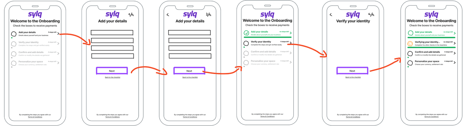
- Tap to Zoom In
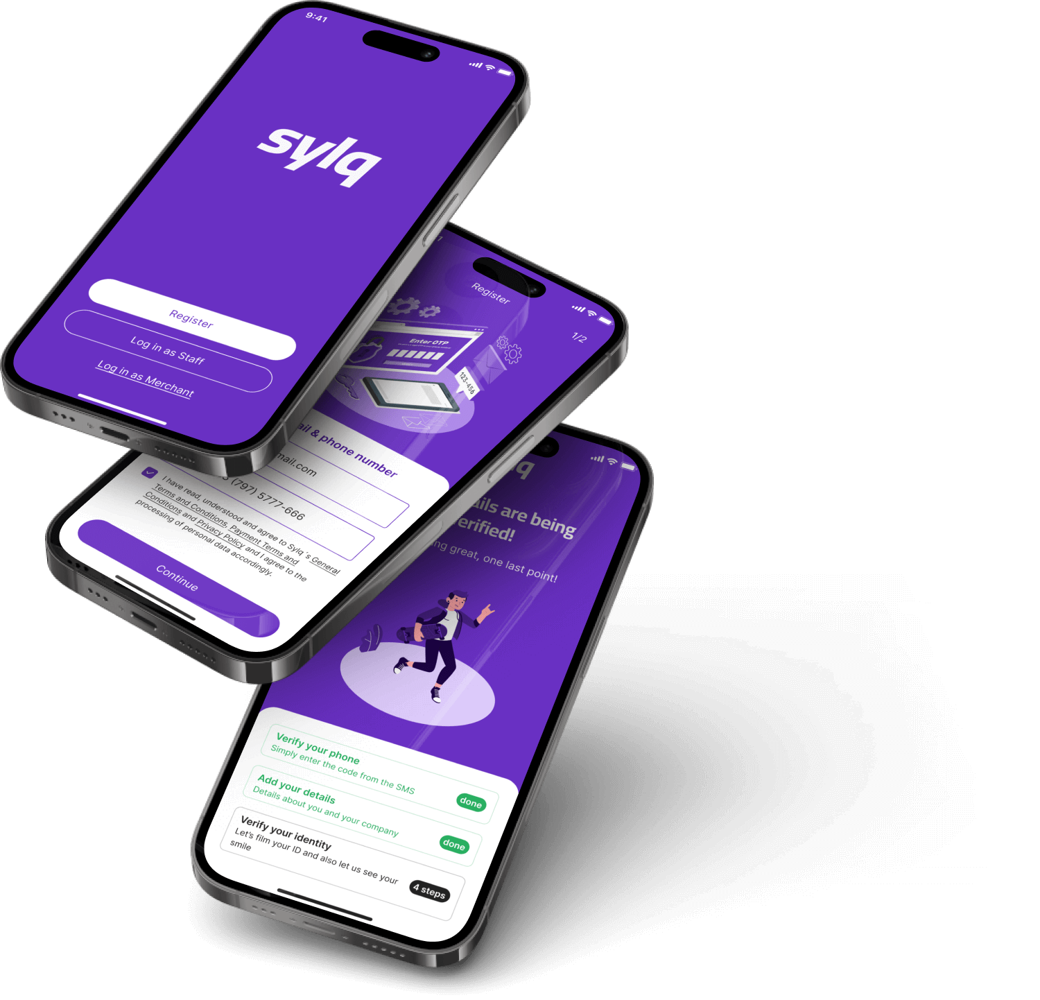
Validation with Stakeholders & Developers
After wireframing, the project entered a key validation phase. With green lights from both the CEO and CTO, and mindful of the technical boundaries, I got down to designing the high-fidelity screens. However, this wasn’t without hurdles. Specifically, we had yet to nail down a KYC/KYB provider, leaving some compliance aspects uncertain.
As a result we had the first draft and below, you’ll find a selection of screens, handpicked from a comprehensive flow of 31 screens.
- Tap to Zoom In
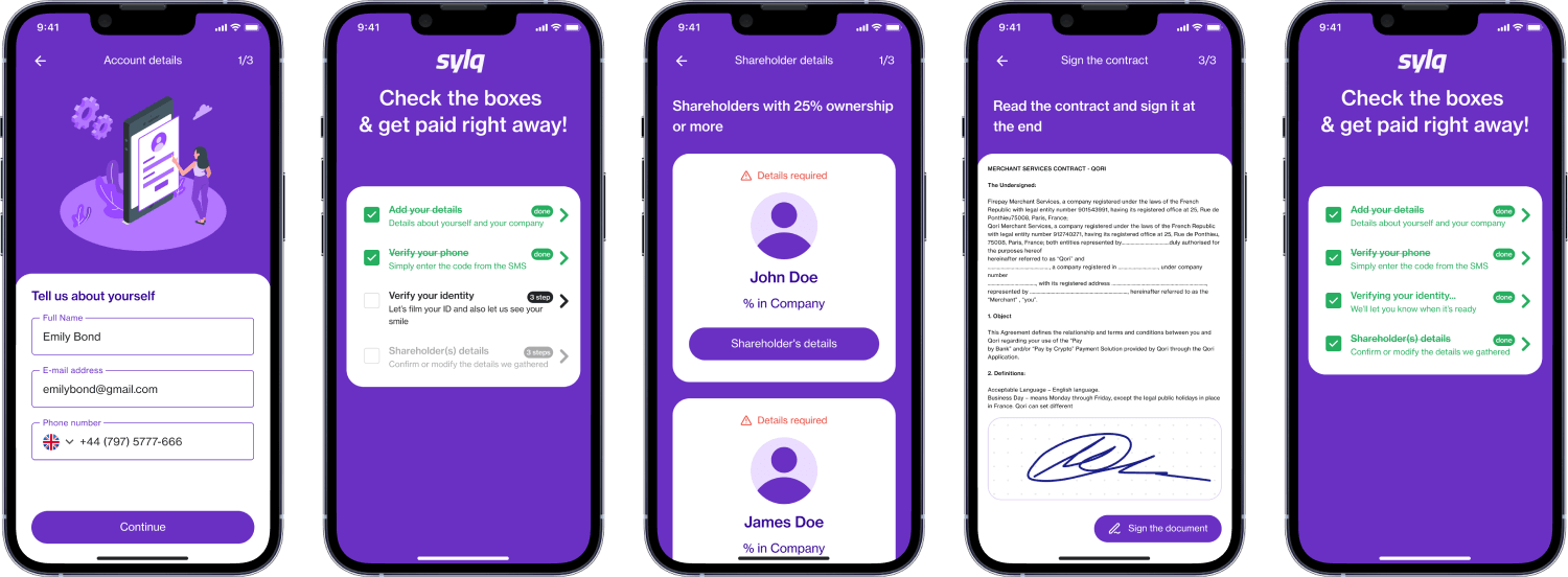
In the midst of this phase, we also conducted consultations with several KYC/KYB providers. These conversations shed light on necessary refinements to our initial approach. We ended up partnering with a provider whose automated systems allowed us to make the user experience smoother by cutting out manual steps. Our compliance team also green-lit us to remove the contract signature step, simplifying the user journey even more by consolidating all requirements under a single ‘check’ icon.
After these changes, I was able to focus on the final version of the onboarding process. To add a dash of flair, I also teamed up with a freelance illustrator, enhancing the user experience through improved visuals.
Below you can see a prototype for the first half of the process:
Compliance and Legal Constraints
While compliance requirements were initially a significant challenge, our approach was twofold. On one end, we collaborated closely with our chosen KYC/KYB provider to streamline aspects such as AML questions and other verification steps. This partnership was crucial for avoiding unnecessary UI clutter and simplifying the process.
On the other end, my focus was on finding providers that could offer API integrations, allowing us to preserve the integrity of our user interface instead of settling for a third-party solution.
The outcome was a user experience that was both legally compliant and visually coherent. These efforts reflected our commitment to not only meet but seamlessly integrate legal requirements into the user journey.
User Feedback & Iterations
Given the language barriers and the offline nature of our primary user base, we had to think creatively about collecting useful feedback.
Our Customer Success representative, who is fluent in French, took the initiative to visit some of our merchants on-site. She presented the interface to them on her phone and observed their interactions and behavior as they navigated through the onboarding process.
This hands-on approach provided us with invaluable insights, including the realization that our ‘Next’ button wasn’t as intuitive as we had assumed. As a result, we replaced it with a clearly labeled ‘Continue’ button, greatly improving the user experience.

Final Milestone: KYC Verification
Due to resource limitations, this part was outsourced to a supplier. While we couldn’t design this component, we white labeled it to make sure it aligned with our brand and provided a good user experience.
Final version!
The final version culminated in approximately 40 Figma screens. However, it’s important to note that this number could have been significantly reduced — likely to around 15 screens — if we had had access to the variable features unveiled at Config 2023.
Sneak peek below:

Results & Insights
Strategic Impact
Before and After: A Transformation
Before: The manual approach limited us to registering a constrained number of merchants daily and made us less attractive to larger businesses in our target market.
After: Our system can now handle hundreds of new merchant registrations daily, without requiring a proportional increase in resources, making us a more attractive solution in the competitive fintech landscape.
Scalability
Automating the onboarding process has been crucial for our ability to scale.
Business Alignment
This feature has aligned Sylq more closely with market leaders like Stripe and Adyen, making us more competitive and appealing to large businesses.
Future-proofing
The system was built with scalability in mind, allowing for easy updates in response to future regulatory changes.
Resource Allocation
Automation has freed up valuable human resources, allowing team members like Karina to focus on other crucial aspects of our operations.
Metrics: The Tangible Impact
Here’s how the new system measures up against the old, manual process:
Speed of Onboarding:
- Before (Manual): It took up to 2 days for a single merchant to be accepted.
- After (Automated): A merchant can now be onboarded in a maximum of 1 hour.
Volume Capability:
- Before (Manual): Onboarding 10 merchants would take 1 week.
- After (Automated): Onboarding capabilities are now scalable with no upper limit on the number of merchants that can be onboarded in a given time frame.
Scalability and Cost:
- Before (Manual): To onboard 1,000 merchants per month, 10 compliance analysts were needed, costing $448,000 per year.
- After (Automated): Zero compliance analysts are needed, with a service cost of only $20,000 per year
What Have I Learned?
Designing within the scope of legal constraints requires thorough questioning and validation before the design phase.
Challenges & How They Were Overcome
The primary challenge was balancing between legal requirements and user experience. This was solved through well-organized management, iterative designs, and constant validations.
Conclusion
This project showcases how design thinking can successfully be applied even within highly regulated frameworks like fintech. The end result was a streamlined, efficient, and legally compliant automated onboarding process that prioritized the user’s experience, all while having a significant strategic impact on the company.
That's a wrap
Jump straight into other case study below