Introduction
Carbify - Website and Web App
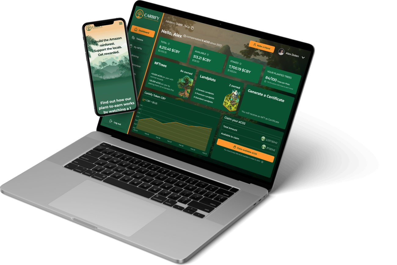
Carbify is a blockchain project dedicated to planting trees and transforming them into NFTs. These trees help absorb carbon from the atmosphere. The team at Carbify has developed a way to tokenize the carbon capture process and convert it into carbon tokens. The expectation is that these tokens will increase in value as regulations push companies to offset their emissions.
Navigate faster!


My Role in Carbify
My collaboration with Carbify began after the founders, familiar with my successful work at my former crypto company called Coorest, reached out to me. Recognizing the importance of a trustworthy online presence for a crypto project, they tasked me with developing a professional and appealing website to coincide with their launch.
The Strategy
Design Approach and Branding
Brainstorming between the decision of adopting a web3 fantasy style or a more eco-friendly approach, I opted for the latter, influenced by Carbify’s primary focus on sustainability. However, considering the upcoming game element, I leaned towards a clean, gaming-inspired aesthetic into the website design, avoiding typical fantasy patterns.
Website creation
Following the brand colors set by a graphic designer, I created a dynamic hero section inspired by gaming websites, featuring layered elements moving at different speeds to overlap with each other. The website also included an ‘About’ page, details on the upcoming game, and a dedicated blog section.
Here’s the homepage design at a glimpse, while the website can be found live at https://carbify.io
Crafting The Carbidash - Web App
Introduction
To ensure Carbify users could effectively manage their environmental contributions and digital assets, the team realized the necessity of a dashboard. This led to the creation of “Carbidash,” a central platform designed for users to oversee their NFTs, monitor carbon token values, and engage with the broader Carbify ecosystem.
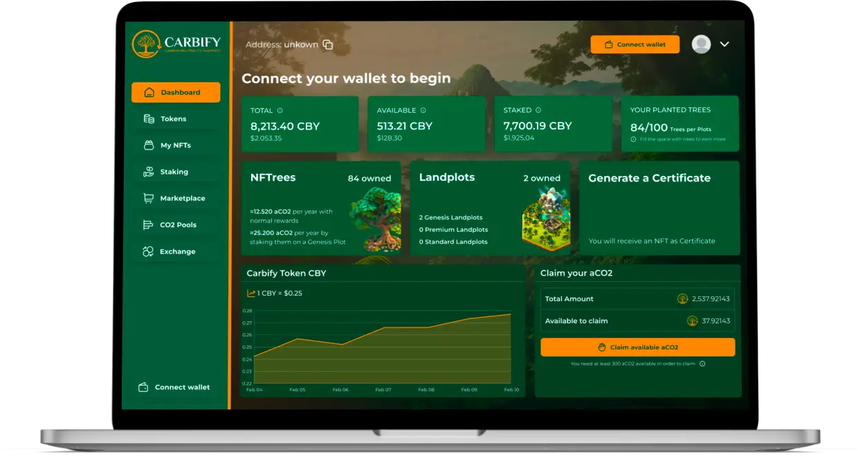
Designing the Homepage - The Dashboard
For the web app, consistency with the website’s branding was crucial. I used Figjam to explore various dashboard layouts, eventually choosing a design that includes clear data presentation and distinct sections for NFTs, alongside a token price chart and a carbon token claiming feature.
- Tap to Zoom In
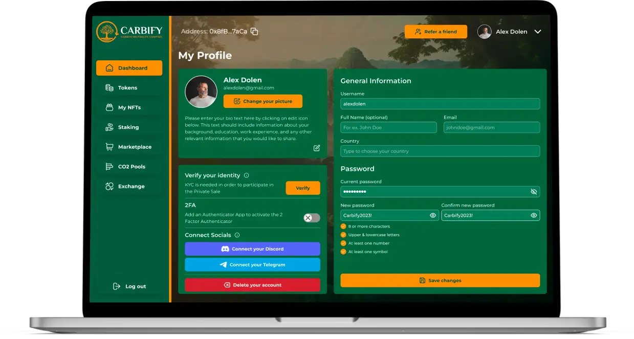
Profile Page
The user profile design focused on simplicity, allowing for easy management of personal details, security settings, and integration of Carbify’s social media links for community engagement.
- Tap to Zoom In
Marketplace
A lot of users got scammed on OpenSea buying Carbify’s NFTs so the need for a dedicated marketplace led to the creation of Carbidash, designed to offer a seamless and familiar user experience while ensuring security and trust. The marketplace layout allows users to explore NFT details, including auctions, bids, and history, drawing on elements from established platforms like OpenSea for user familiarity.
CO2 Pools Concept
CO2 Pools are a key part of Carbify, acting like a special market for trading carbon tokens. Imagine a big company, say Shell, needs to buy lots of these tokens to offset its carbon footprint. The twist with Carbify is that the tokens aren’t all held in one place; instead, they’re spread out among all the people in the Carbify community.
So, Carbify sets up a CO2 Pool. It’s like a call to action for the community, asking them to offer up their tokens at a set price. Everyone in the community can decide if they want to sell their tokens in this pool. It’s a bit like having a say in a big, collective sale.
What makes it exciting is the deadline for the pool and how supply and demand play out. If not many people put their tokens into the pool, it might mean the token’s price could go up later, so some might hold onto theirs, hoping for a better deal. But if the pool fills up quickly, it shows lots of people are ready to sell, which can affect the token’s price right then.
This approach gives everyone who owns tokens a bit of power in the market, making it more than just a simple buy-and-sell situation. It’s a smart way for Carbify to mix tech with helping the environment, and it keeps everyone involved and interested in how things are going.
In my designs this looked like this:
Staking Feature with Virtual Plots
The next key feature in the app was staking. I hadn’t talked about Carbify’s other NFTs, the Plots, because they weren’t that relevant yet. But these plots are crucial for the upcoming game and the staking system. There are three types of plots, and they offer bigger staking rewards because they’re more valuable and less common.
The staking part was pretty complex because it involved advanced blockchain tech, so I had to get all the technical details straight in a meeting with the developers. We figured out that users could stake specific trees on certain plots, which meant we needed to make sure this feature was easy and clear to use.
Below you can see two different modals for both Staking and Unstaking:
Conclusion and Impact
The work on Carbify’s website and web app has significantly contributed to its reputation in the blockchain community. With over $3 million raised during its IDO phase and 250,000 trees sold and planted in the Amazon Forest, Carbify’s success is a testament to the effective collaboration and innovative design strategies employed.
- Discord announcement from one of the Co-Founders of Carbify
Final Notes
Wrapping up
Working on Carbify’s project helped me reaffirm my beliefs about blockchain: even though a project can be amazing and the technology even more mind-blowing, it’s ultimately the design that bridges the gap between the user and the technology. Blockchain is still not ready for the vast majority of people to adopt, and it’s our responsibility as designers to make the transition from Web2 to Web3 seamless for users, turning everything complex into intuitive assets.
That's a wrap
Jump straight into other case study below


